


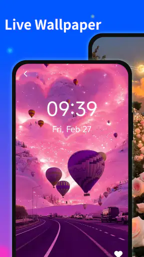
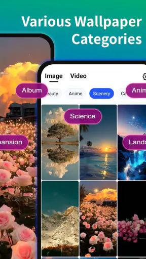
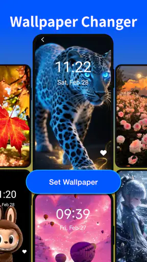

I tried Colorful Wallpaper as a straightforward way to give an Android screen more personality, and my first impression was positive: it focuses on the visual result rather than turning wallpaper selection into a complicated project. This is a free personalization app from ByteLab Studio, aimed at people who want vibrant backgrounds without spending time building a complete theme.
That simplicity is also the key to understanding it. I would not approach it as a full home-screen customization suite or as a replacement for a dedicated wallpaper editor. Its appeal is narrower and clearer: choose a colorful image, apply it, and make the phone feel less ordinary. For someone who changes backgrounds with the seasons, matches a phone to a case, or simply finds a plain system wallpaper dull, that focus can be useful.
Getting a colorful background onto the screen without unnecessary friction
The first place many wallpaper apps become frustrating is the final step. Browsing can be enjoyable, but the experience only matters if the selected image actually appears where expected. With this kind of app, I recommend treating the process as two separate decisions: first choose the image, then decide whether it belongs on the home screen, the lock screen, or both. Keeping those choices distinct helps avoid the common mistake of applying a good background to the wrong place and assuming the app failed.
Another small but important check is the preview. A wallpaper can look balanced in a gallery and become distracting once icons, widgets, and notification text sit on top of it. I found it more useful to judge the lower and upper parts of the image separately. The area behind app icons needs enough contrast for labels to remain readable, while the lock screen has to leave visual breathing room for the clock and notifications.
The best result comes from choosing for readability, not just color intensity. Very bright backgrounds may look impressive at first glance but can make everyday navigation tiring. If you use many icons, a more open design or a calmer section of the image is often better than the most saturated option.
What to check before blaming the wallpaper app
Colorful Wallpaper supports Android from version 9 onward, so compatibility starts with the phone itself. If the device runs an older system, installation or normal operation may be the problem rather than the selected image. On a supported phone, I would still check that the system has enough free space and that the app has finished loading its content before repeatedly tapping the same control.
It is also worth checking the phone’s own wallpaper settings after applying an image. Android manufacturers sometimes place their own confirmation screen between an app and the final result. That extra step can look like a stalled application when it is really a system-level choice waiting for confirmation. If the image appears in a preview but not on the home screen, I would inspect the launcher settings before reinstalling anything.
Battery-saving modes can also affect how quickly visual content loads or refreshes. This matters especially on phones that aggressively pause background activity. I would first open the app normally, wait for the selected image to display, and apply it while the phone is awake and connected to a reliable network. That is a practical setup habit, not a promise that every device will behave identically.
The app is free, which makes it easy to try without committing money. Its age rating is Everyone, so it is positioned as a broadly accessible personalization choice rather than something aimed at a narrow adult audience. Still, parents or shared-device users should judge the images personally, because a general age label does not tell you whether a particular visual style will suit every family member.
A sensible setup routine for a cleaner home screen
My preferred routine is simple. I first take note of the current wallpaper, especially if I have a carefully arranged home screen. Then I preview a few colorful choices without immediately applying each one. This avoids repeatedly changing the system background and makes it easier to compare how the same icons look against different compositions.
After selecting an image, I apply it to one screen first when the phone offers that choice. The home screen is the most useful test because it reveals whether icons, folders, and widgets remain clear. If the result works there, extending it to the lock screen is more likely to feel intentional. If it does not, I can change course without disrupting every part of the phone’s appearance.
A useful habit is to keep a plain fallback wallpaper available in the system gallery. Colorful designs are not always ideal during work, travel, or outdoor use. Switching temporarily to a quieter background can improve legibility, and it gives me a quick way to tell whether a visual problem comes from the image itself or from the launcher.
Recovering when the result does not look right
If a chosen background does not appear, I would avoid making several changes at once. First I would return to the app and confirm that the image is fully visible in its preview. Next I would use the phone’s normal wallpaper settings to see whether the system recognizes the change. Finally, I would lock and unlock the device or return to the home screen to refresh the launcher view.
This step-by-step approach matters because wallpaper changes can involve more than one layer: the app provides the image, Android applies it, and the launcher displays it. Restarting everything immediately may hide which layer caused the trouble. A slower check is usually more informative and saves time if the same issue happens again.
If the application closes or behaves strangely, I would begin with ordinary maintenance: close other demanding apps, reopen it, and make sure the phone is not nearly full. If the issue continues, restarting the device is a reasonable general troubleshooting step. I would not assume that clearing every setting is necessary, especially if the problem only affects one particular image or one display mode.
There is another practical recovery method for people who change wallpapers often. Apply a known working image from the phone’s regular settings. If that succeeds, the display and launcher are probably functioning normally, and the next test can focus on Colorful Wallpaper. If even the system’s own wallpaper tool fails, the third-party app is unlikely to be the main cause.
When the app is not the cause
Some apparent wallpaper problems come from the launcher. A custom launcher may crop the image differently from the manufacturer’s default launcher, while a scrolling home screen can make the background appear shifted. In that situation, the image may have been applied correctly; the launcher is simply presenting it according to its own layout rules.
Widgets can create a similar illusion. A large clock, calendar, or search bar may cover the most attractive part of a colorful design, making the result feel wrong even though the wallpaper is working. Before judging the app, I would temporarily move one widget or test the image on a less crowded page. That quick comparison often reveals whether the issue is composition rather than installation.
Display settings can change the character of the colors too. Brightness, night display modes, color profiles, and manufacturer-specific enhancements may make a vivid background look muted or unusually warm. If the image looks different in the app preview and on the home screen, I would compare the phone under normal display settings before deciding that the source image is poor.
Screen resolution and aspect ratio are also worth considering. A background designed to fill a tall phone may be cropped on another device, especially when the system allows horizontal movement between home pages. The practical trade-off is that a dramatic image may lose its focal point after cropping. I prefer designs with visual interest spread across the frame rather than one important detail placed at the edge.
How it compares with the usual alternatives
The most obvious alternative is the wallpaper picker already built into Android. That option is often faster for people who want a basic image, a system collection, or a photo they already own. Colorful Wallpaper makes more sense when the main goal is a stronger, more deliberately vibrant look without manually searching through personal photos.
Another alternative is a full customization app that combines wallpapers with icon packs, widgets, lock-screen controls, and theme settings. Those tools can produce a more unified design, but they also introduce more decisions and more opportunities for conflicts between the launcher, icons, and system interface. I see ByteLab Studio’s app as the less demanding choice: it changes the visual backdrop without asking me to redesign the entire phone.
Photo editors are better when I want precise control. I can crop a personal picture, add text, soften colors, or create a background around a specific widget arrangement. That flexibility comes at the cost of time. Colorful Wallpaper is more convenient for a quick visual refresh, while an editor is the better choice for a personalized result that depends on exact placement.
For users who expect animated backgrounds, automatic rotation, or deep controls over how images behave, I would look toward a specialized live-wallpaper or advanced wallpaper tool instead. This app’s strength is not complexity. Its value is in making a colorful static change easy to try, provided that is the kind of change you actually want.
Everyday situations where the app makes sense
One realistic use is a phone shared between work and personal life. During the week, I might choose a bright but uncluttered image so the home screen feels energetic without reducing icon clarity. Before a weekend trip, I could switch to a more expressive background that matches the mood of the occasion. Because the app is free, experimenting with that small change feels low-risk.
It can also help when a phone has started to feel visually stale after months of identical settings. A new background does not improve performance or change how apps work, but it can make the device feel refreshed without requiring a new launcher, icon arrangement, or complicated theme package. That is a modest benefit, yet it is exactly the sort of small improvement many personalization apps are meant to provide.
People who take screenshots for social posts may appreciate a more distinctive background, but they should test notification visibility first. A colorful screen can look excellent in a clean screenshot and become noisy when real alerts appear. I would use a less detailed image behind frequently captured screens and reserve the boldest designs for a secondary home page.
The app is less suitable for someone who needs a highly controlled visual system. If your phone depends on carefully matched icons, a fixed widget layout, or a background designed around accessibility needs, a general colorful collection may not be enough. In that case, creating or selecting an image manually gives you more control over contrast and placement.
What the current release suggests about the experience
The current version is 1.0.6, and the app was released on March 9, 2025. That places it in a relatively early stage compared with long-established personalization platforms. I would therefore approach it as a focused tool that may evolve, rather than expecting the depth of a mature customization ecosystem.
Its public response is reasonably encouraging but not flawless: the app has a 3.9 average from around 1.4 thousand ratings, with over one million installs and twenty-one written reviews. Those figures suggest that it has reached a substantial audience while still leaving room for mixed experiences. I would read that as a reason to test it on your own phone rather than treating the score as a guarantee of perfect setup.
The combination of a free price and a broad audience makes trying it straightforward. The more important question is whether its visual approach fits your habits. If you rarely change your background, the built-in Android picker may already be sufficient. If you enjoy refreshing the phone’s appearance but do not want a full theme-management workflow, this app occupies a useful middle ground.
My practical verdict
I recommend Colorful Wallpaper to anyone who wants a quick, colorful change and is comfortable checking the final result on the actual home screen. I like that the app’s purpose is easy to understand, and the free entry point makes it suitable for casual experimentation. The strongest workflow is to preview carefully, test for icon readability, apply the image through the system confirmation when needed, and separate app problems from launcher or display behavior.
I would skip it if you are looking for live effects, detailed editing, automatic wallpaper rules, or a complete icon-and-widget theme. Those needs call for a more specialized alternative. I would also be cautious with very busy images on a crowded home screen, since the visual energy that makes them attractive can quickly become a usability problem.
For my own use, the app works best as a small reset button for an Android phone: open it when the current background feels tired, choose something with enough quiet space for the interface, and keep a calmer fallback for practical moments. It does not need to transform the whole device to be worthwhile. When used within that narrower role, Colorful Wallpaper is a convenient free personalization option with a clear benefit and manageable setup friction.


